Citibank Loan Dashborad Redesign
June 2024
What is the loan dashboard?
It is an online application that guides borrowers through the loan borrowing process.
(Mortgage, personal loan, small business loan, etc)
My Role
UX/UI Design
Tools Used
Figma
Zoom
Project Duration
June 2024 ~ August 2024
Understanding the problem
Internal Citi client came to our team stating that their Loan Dashboard users have a hard time following the application process through to completion.
Business objective
To provide UI and UX recommendations for the Citi Customer Home Loan Dashboard that will reduce cognitive load, minimize known pain points and modernize the design to match Citi brand standards.
Our main goal
*To efficiently guide the user to complete the application process while giving them a sense of accomplishment.
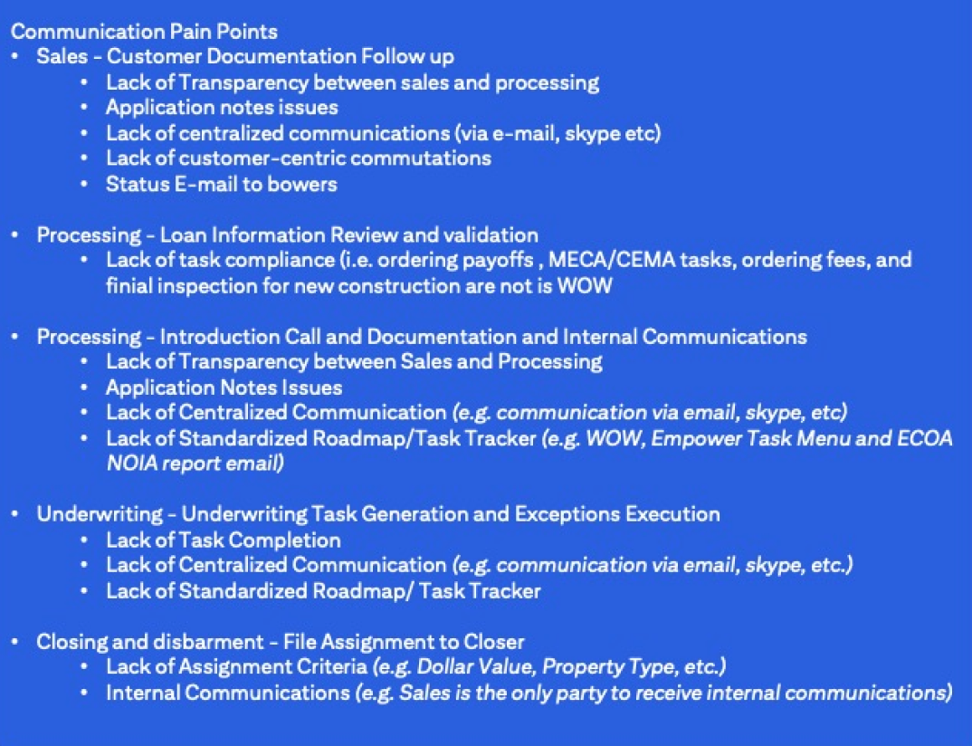
User paint points
- Lack of centralized
communications
- Application status hard to follow
- Information overload
- Lack of task completion
- Anxiety-inducing process
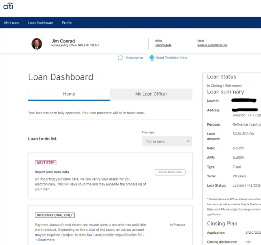
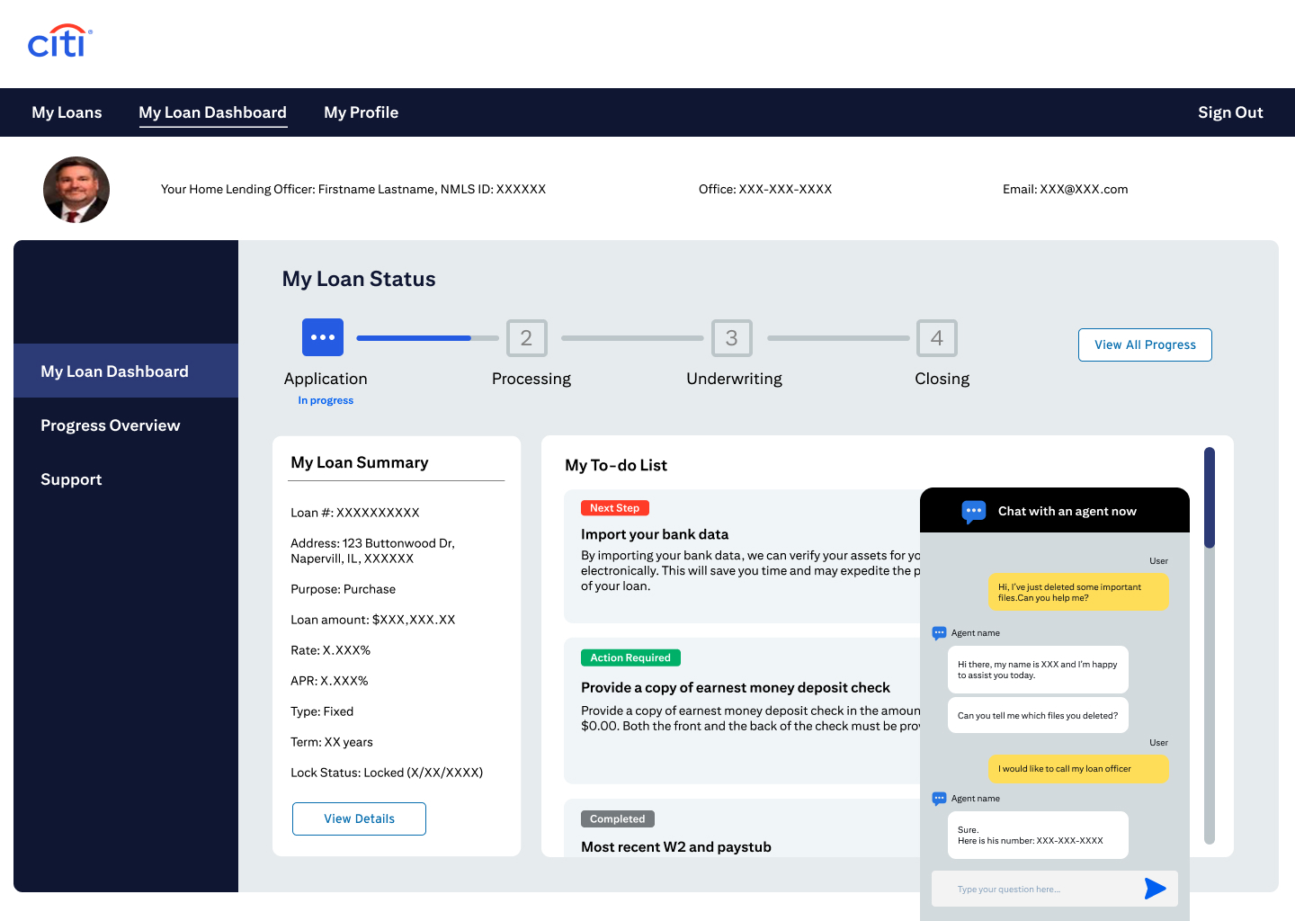
Current Loan Dashboard
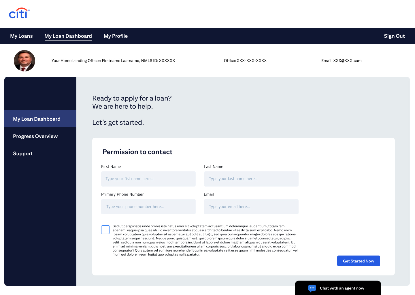
User sign-up flow

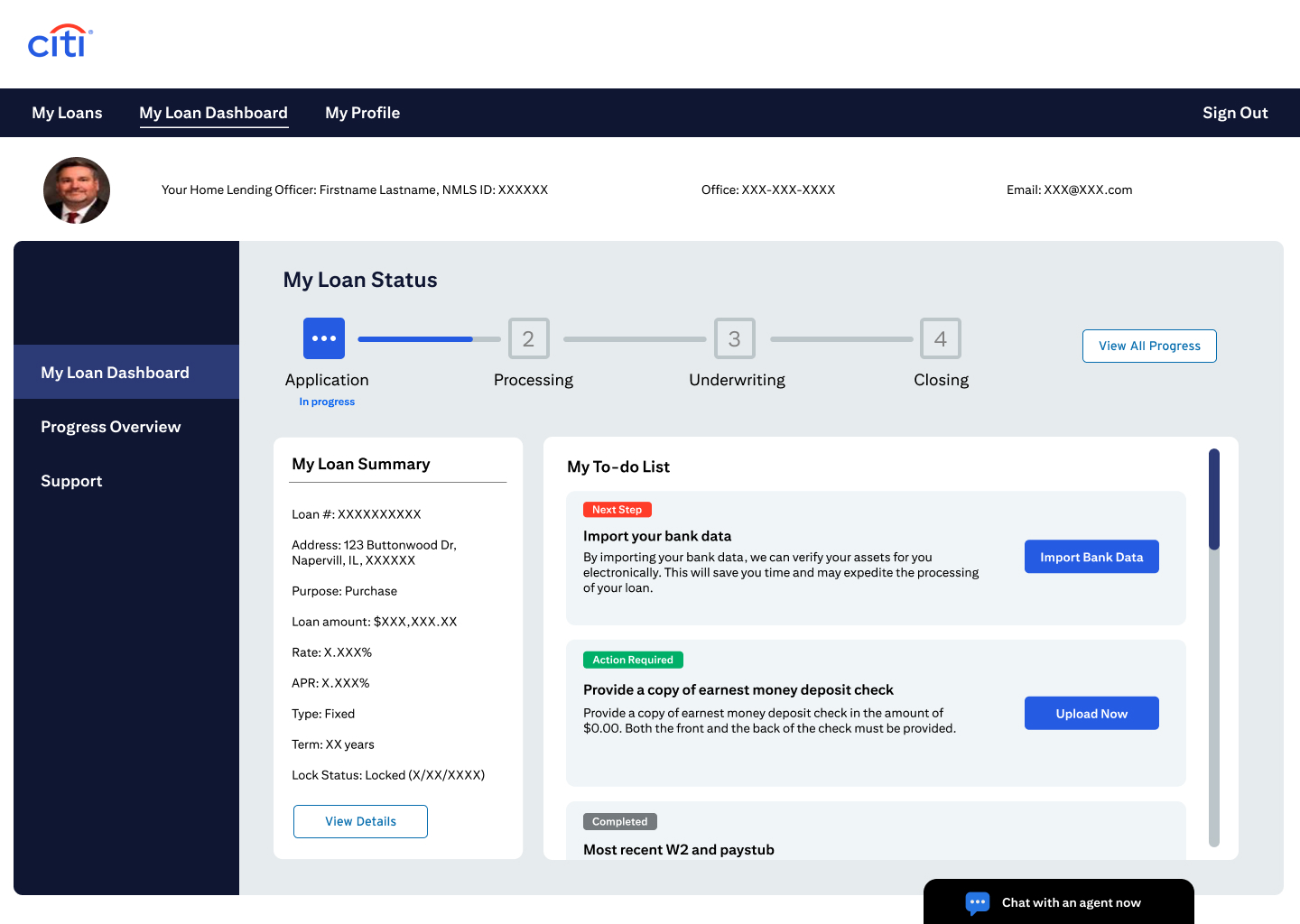
Loan application milestones

Ideation
Persona creation
“One Loan” John
John has already been assigned a loan officer. Now he is in the process of starting, completing, and closing his loan using the Loan Dashboard.
Our recommendations
Refreshed Layout
- Familiar, modern design that users recognize
- Improves overall dashboard navigation
- Aligns to user’s existing mental model of web applications
Progress Tracker
- Visual tracker that shows status of loan
- Outlines the current status of application
- Keeps users updated on milestones and tasks
Streamlined Dashboard
- 2-column layout that's easy to scan
- Consolidates user's to-do list
- Prioritizes actionable information with clear visual hierarchy
Simplified Data
-
Cleaner, less visually crowded loan summary breakdown
- Condenses information that is less pertinent to user
- Content hierarchy makes processing information easier for the user
Increased Transparency
- Visual progress bar keeps users informed on status
- Clear tracking on pending items tells user where their loan is in the process
- Increases user confidence in the application process
Resource Hub
- Helpful instructional and informational microcopy
- Easy-to-find FAQs at bottom of the page
- Simplifies user navigation
Citi Branding
- Dashboard style updated to modern Citi standards
- Adds visual cohesiveness across the board
- Reaffirms brand trust through consistency
Design
Intial screens
Loan application screens


Home screens
Evolved screens
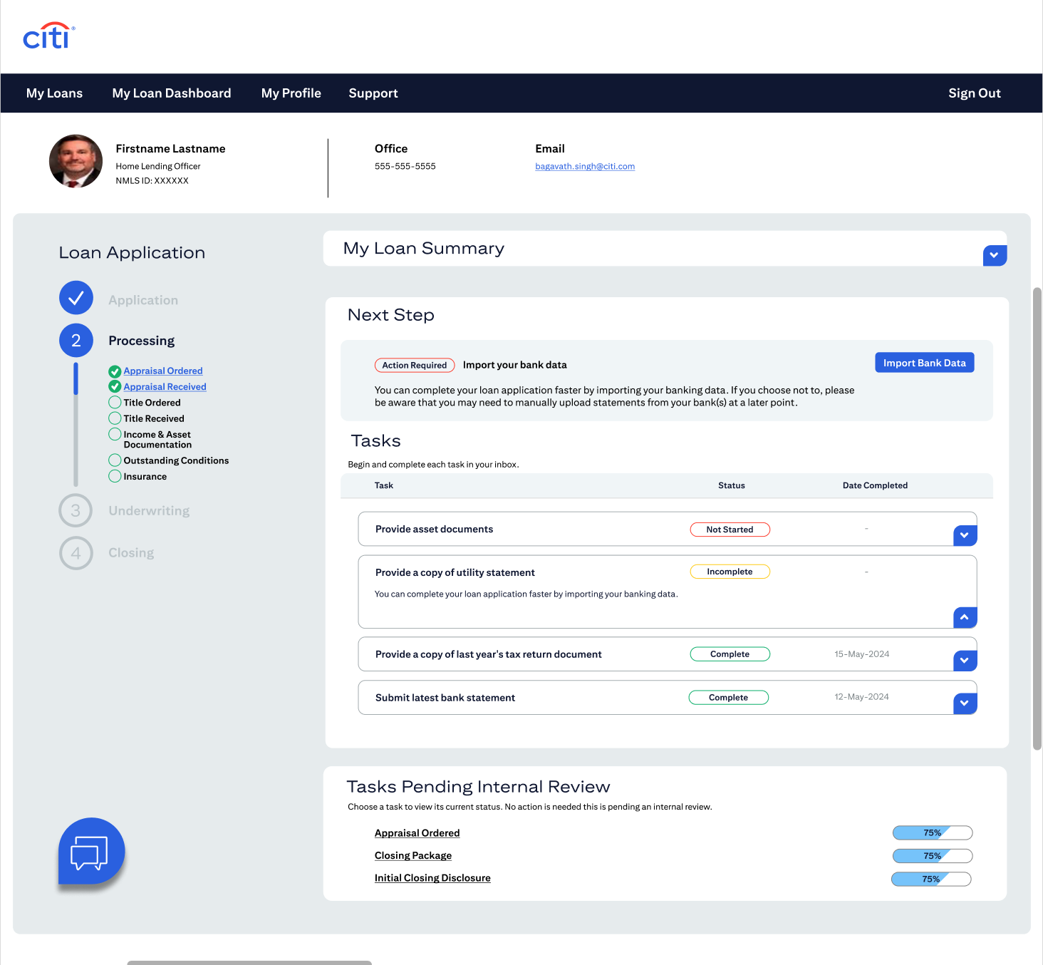
Improved layout
Improved overall dashboard navigation by crafting a design that aligns to user’s existing mental model for modern web applications.The new dashboard design should align with the user's existing knowledge of similar applications. With this in mind, we aligned on a familiar 2-column layout with the progress tracker in a thin column on the left and loan summary, action items and task status in a larger column on the right. This design reduces vertical scroll, adds visual hierarchy and leads the user to take action on high-priority tasks.
Features
- 2-column layout that breaks up information visually for easy scanning
- Vertical scroll is reduced with important items at the top of the page
Intro of Progress Tracker
Introduced a progress tracker that outlines the current status of application milestones and tasks.
This feature list out the application milestones, and the user interface is contextual and adapt to the user’s current place in their loan application. The tracker’s state should change based upon the user’s current step and indicate which tasks are complete, in-progress and forthcoming.
Features

Updated informational tasks
Organized useful information content to aid in user navigation.Our team is recommended moving “informational to-dos” into a separate section of the dashboard, thus making navigating the dashboard and completing tasks easier. This change is aimed to increase user’s trust and improve conversation and retention.
Features
- Always-accessible “Informational Tasks” at the bottom of the dashboard moves items that do not require user action near the bottom of the screen.
- Accordian-style content display that highlights the most pertinent information

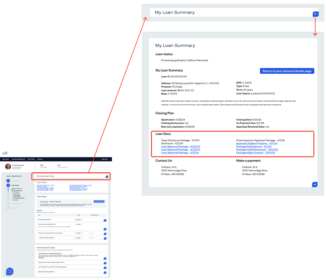
Simplified data
Our design is aimed to reduce cognitive load by formatting information that is repetitive or not immediately urgent.
The dashboard hosts all the information relating to the user’s loan application, which can be overwhelming for users to take in all at once. To put users at ease, the team is recommending the introduction of accordion-style components that abbreviate less important information while still making the content available to the user anytime.
Features
- Accordian-style sections highlight the information users want to see
- Content hierarchy visually prioritizes information for the user
Updated UI elements
In addition to providing recommendations, the UX team also created UI elements that can be reused throughout the application. Based off of Atomic design principles, these “atoms” can be combined in a variety of ways to build larger and more complex elements, known as “molecules” and “organisms,” that become reusable patterns and page templates. Shown on the right are a few examples of these UI elements.

Before
After

What we hope to see with future user testing and iteration rounds
-
Increased task completion
- Increased loan dashboard engagement
-
Decreased time spent on competing tasks
-
Decreased call-ins and emails
My Role
UX Design
UI Design
Visual Design
Tools Used
Sketch
Principle
After Effects
QuickTime
Project Duration
December 2019 to February 2020
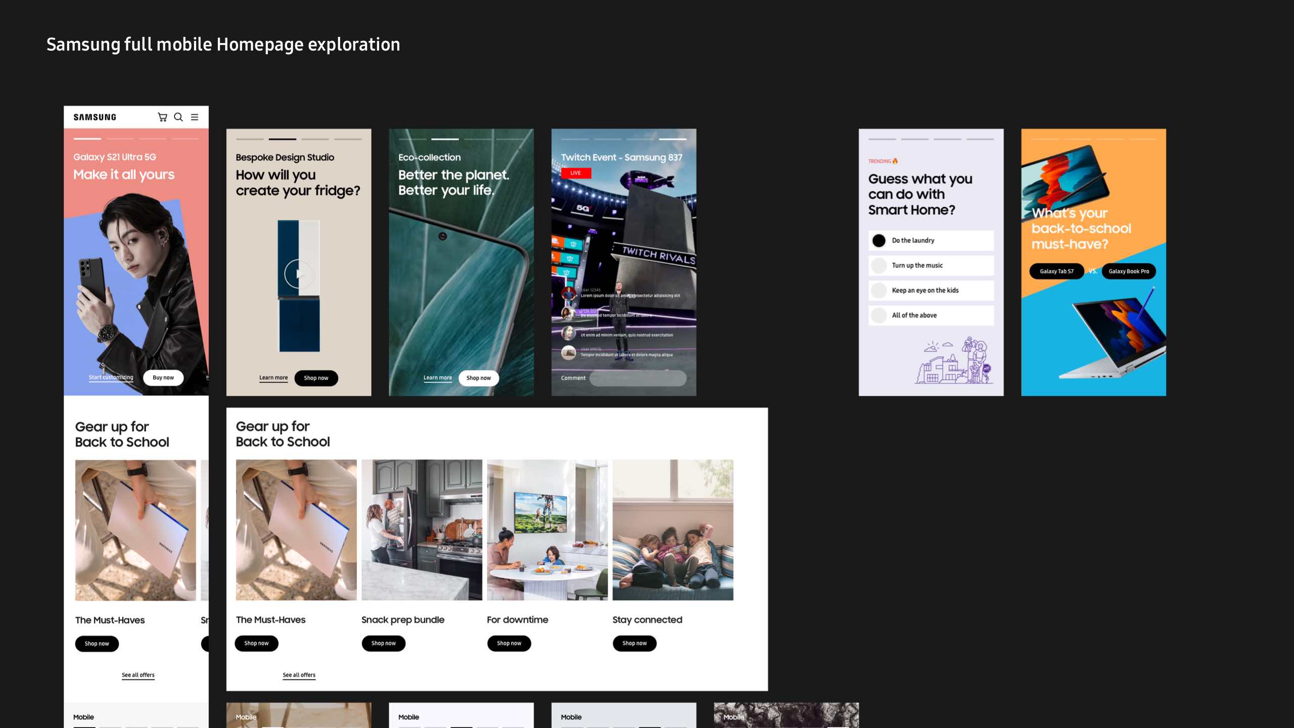
Main goal
To surface the many pages on Samsung.com that contain engaging stories of the Samsung products that are seemingly hidden on the site to improve conversion and engagement rates.


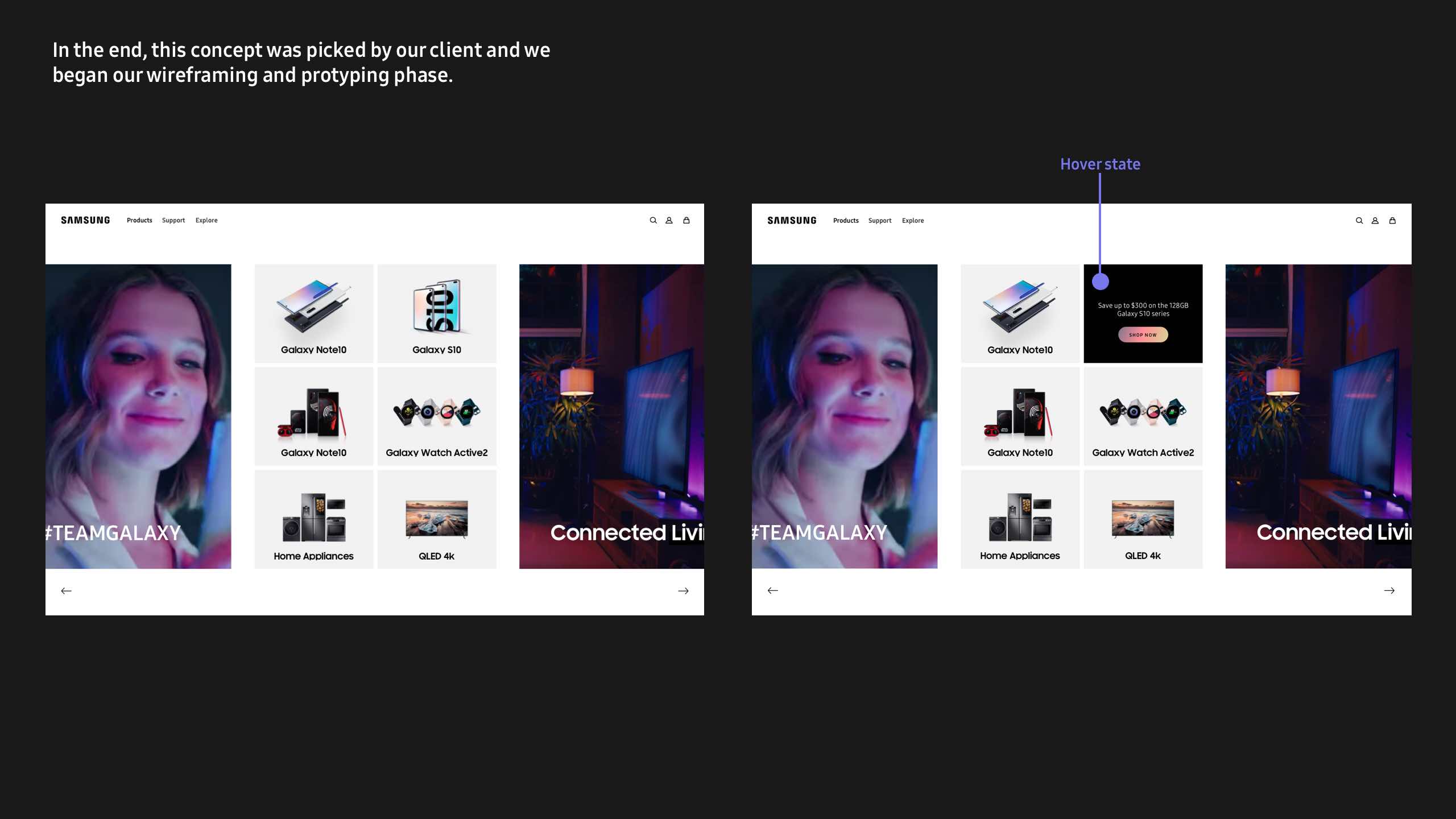
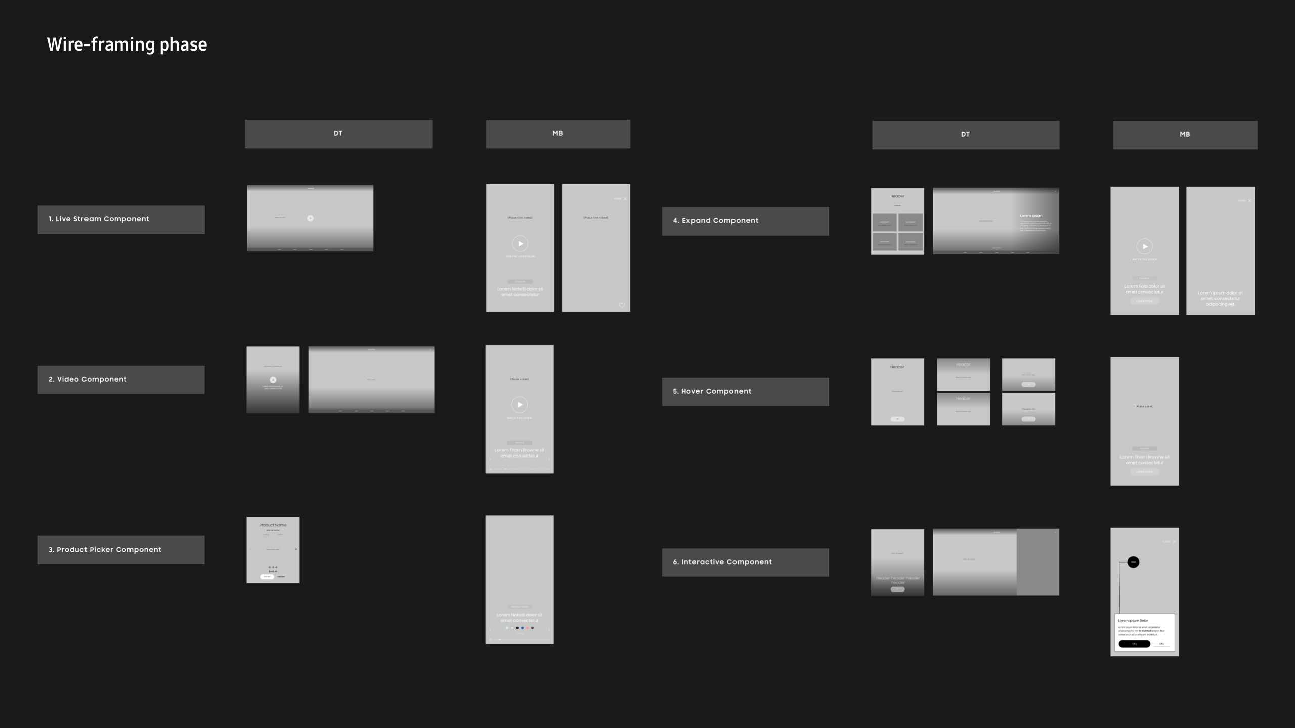
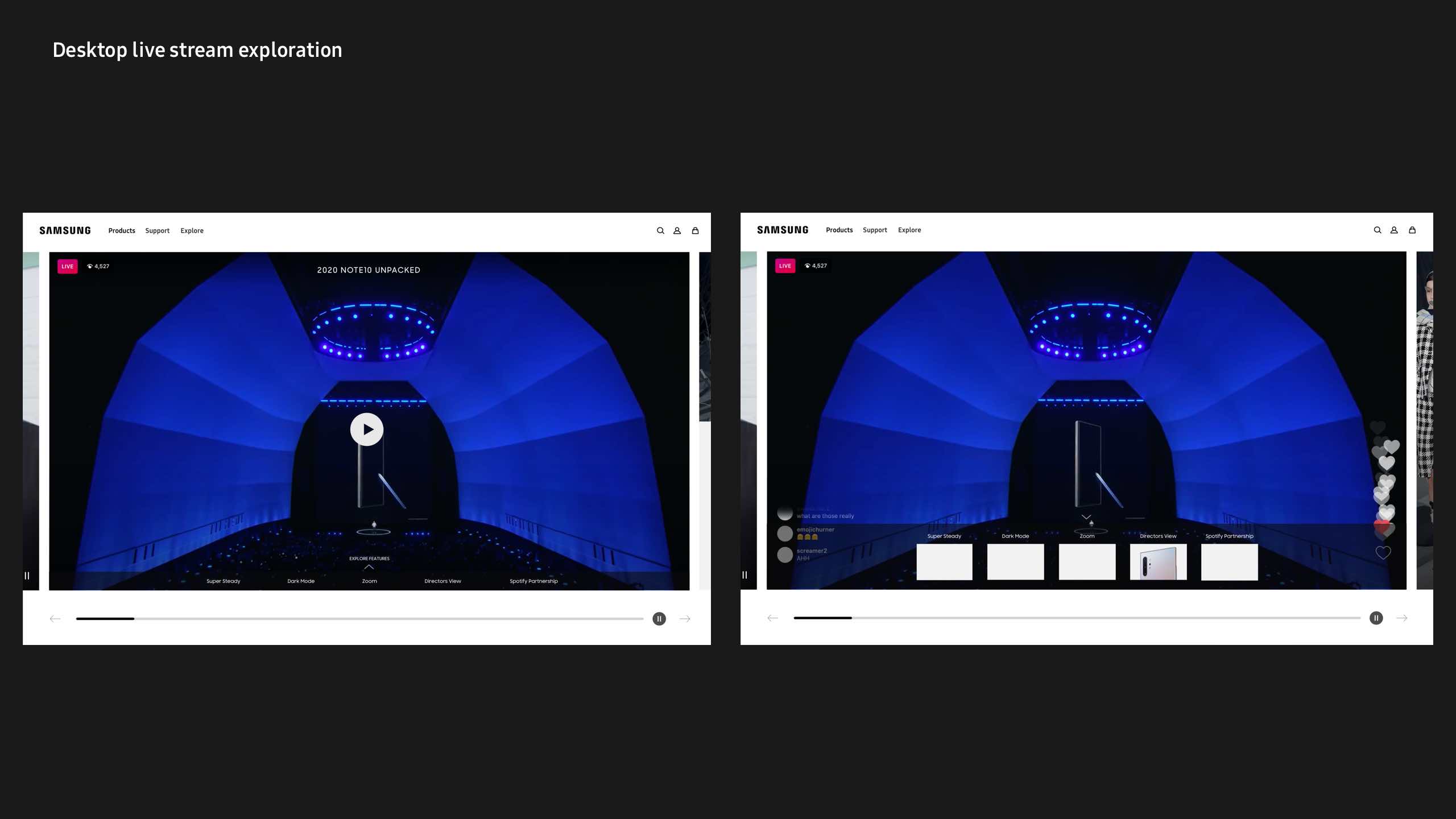
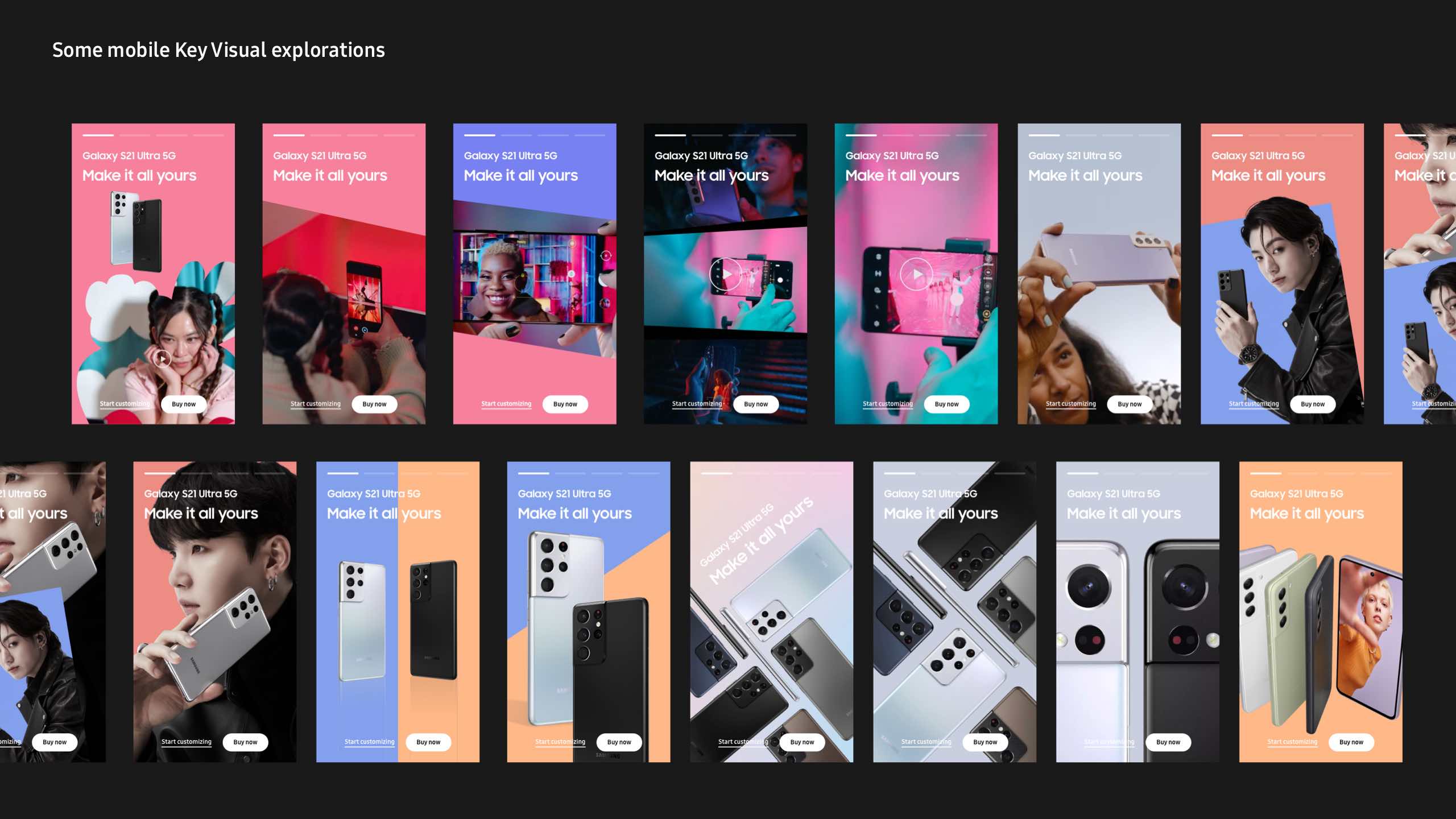
This is the prototype we pitched to the client:
(Made in Sketch and Principle)

Live desktop and mobile homepage launched at 10% of global traffic:
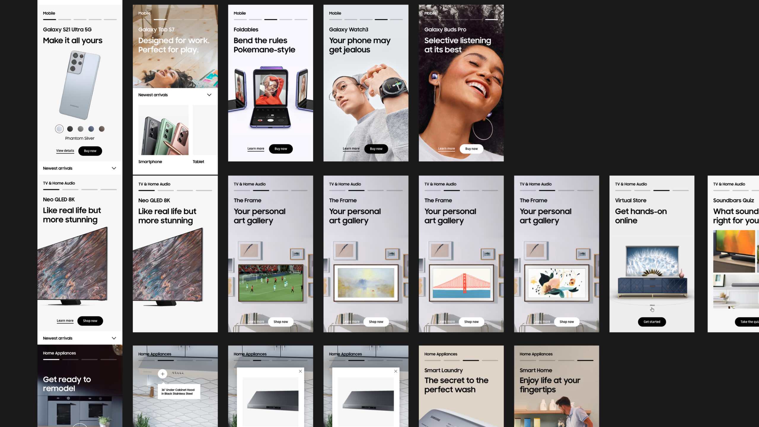
Interactive mobile component explorations:

Desktop Shopable Showroom exploration:

Interactive desktop live stream component explorations:
Mobile key visual explorations:
Mobile full page content mock-up:

Desktop full page content mock-up:

Future state-
Mobile and desktop full page mock up:
(We kept the story-based component structure but reverted desktop version back to vertical scrolling)

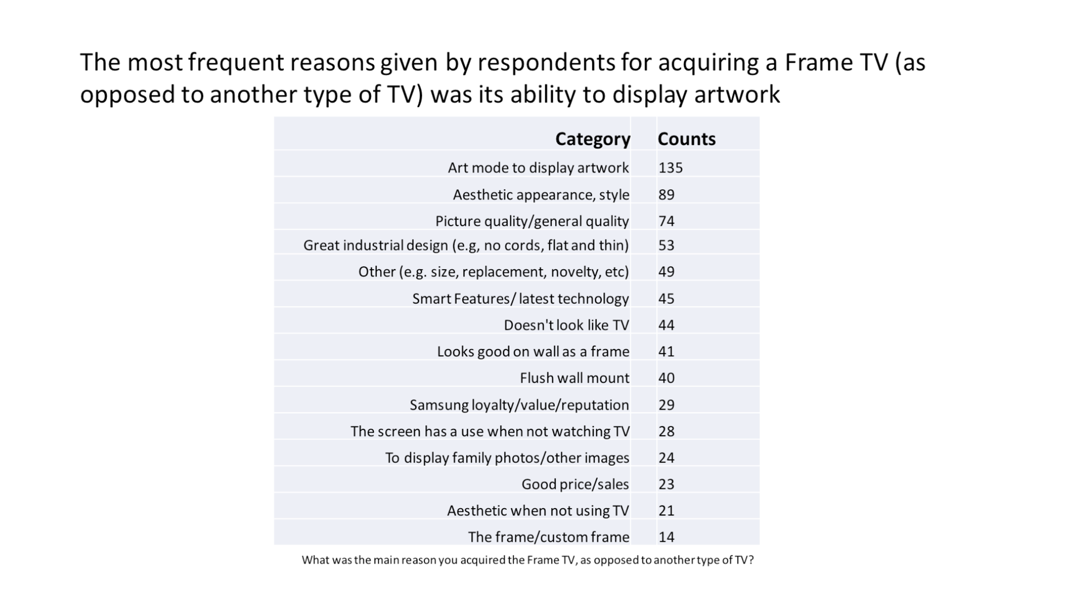
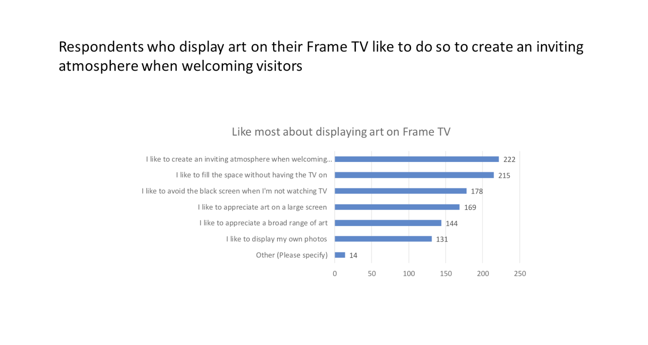
Refresh of the Frame TV marketing landing page on Samsung.com to drive
awareness of The Frame 2022 TV, help drive down funnel consideration, as well as to help drive premium sales with design-focused customers.
https://www.samsung.com/us/tvs/the-frame/highlights/
https://www.samsung.com/us/tvs/the-frame/highlights/
Launched: August 4th, 2022
The Frame MLP has seen 22K visits since launch with a 46% continuation rate.
(+27 ppts vs benchmark of previous version)
Data shown from August 11th, 2022
Marketing Objectives:
- Capture search demand for branded and non-branded keywords related to QLED technology, as well as digital art
- Capturing traffic around NFTs as The Frame 2022 has display capabilities for these
- Provide onsite options to nurture customers down funnel
- Educate customers about the evolution of the 2022 TV technology & features
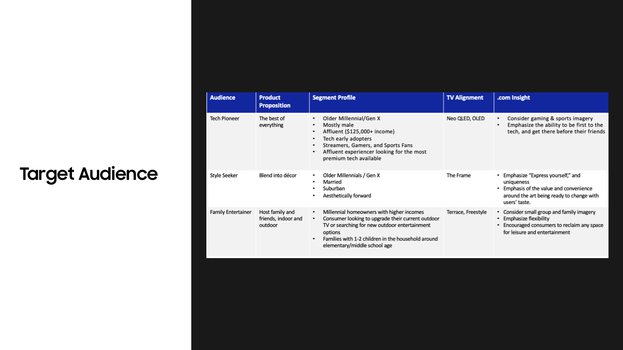
Target Audience Profile
- Married
- Suburban
- Aesthetically forward
- Primary:
Style
Seekers
-
Product
Proposition: Enhances
your home décor by blending in
- Consumer
Lifestyle Need: Blend
into décor
- Segment Profile:
- Married
- Suburban
- Aesthetically forward
Overall
Samsung Consumer Lifestyle:
- 41% of Samsung owners state that they would love to control their home via smartphone or voice
- Traveling is an important interest of Samsung owners
- 18% of Samsung owners value always owning the latest technology
- Samsung owners access the internet via a smart speaker more often than TV owners overall
Market Trends:
Aesthetic Effect
Lifecycle: Mainstreaming - Gaining wider traction
Beauty and function:
A good aesthetic conveys the instant message to consumers that this is good, that it is premium and thus can indicate something about their choices, taste and identity.
Affection promotes wellbeing
Consumers are leveraging aesthetic experiences to relieve stress, improve their moods and enjoy moments of escape from sometimes oppressive reality.
Personal identity expression
Aesthetic experience has moved beyond a personal experience, it is expanding to be self-expression, a social channel and a means of connecting with like-minded communities.
Digital Aesthetics
The application of aesthetics is not limited to physical goods. From NFTs launched by luxury brands, brand posts on Instagram to fantastic avatar identities in the metaverse, brands are leveraging aesthetics in virtual spaces as well to catch people’s attention and retain their loyalty.
What this trends means for .com:
Messaging
Emphasize “Express yourself,” uniqueness, and the ability to have your art change with you - focused messaging
Interactivity
- Potential for an AR module to see the Frame in their home space
- Potential for a P6 type quiz to help users select example art and see how it fits into their home space.
-Could add a social component to the site, to see how owners are using the Frame or Community Favs.

UX thinking
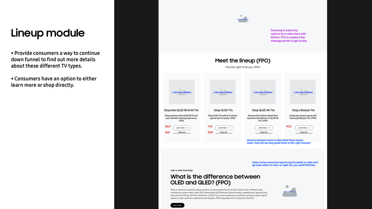
Highlights tab
https://www.samsung.com/us/tvs/the-frame/highlights/
Design & Accessories Tab
https://www.samsung.com/us/tvs/the-frame/design-and-accessories/
Art Mode & Technology Tab
https://www.samsung.com/us/tvs/the-frame/art-mode-and-technology/
https://www.samsung.com/us/tvs/the-frame/highlights/
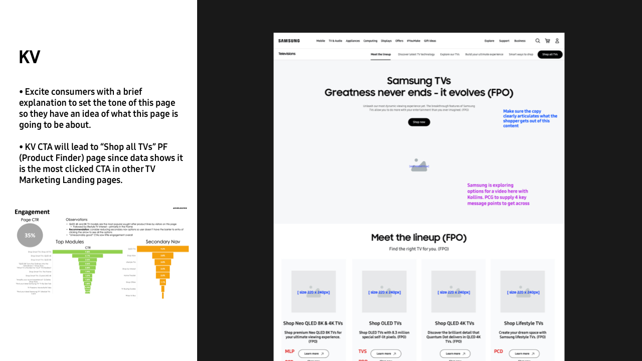
- Since the “Matte Display” is a brand new techonogy introduced with The Frame 2022 model, we get right into below the fold as an educational moment to emphasize how the matte display improves the quality of the art customers exhibit.
- Throughout the entire highlights tab, we are focusing on how customers can personalize their own TV as the main message since our target audience is style seekers.
- We’ve also added a social component to the page to showcase how owners are using The Frame.
-
We are also capturing traffic around NFTs as
The Frame 2022 has display capabilities for these by including “NFT” as one of the key words on the page.
https://www.samsung.com/us/tvs/the-frame/design-and-accessories/
- Historically “Art Mode” and “Technology” tabs have always come before “Design” and “Accessories” tabs in previous iterations of The Frame MLPs, but we’ve decided to merge “Design” and “Accessories” tabs into one tab to simplify and optimize the experience. They also now come before “Art Mode” and “Technology since our target audience is style seekers, we want to bring forth the customizable and personalization elements first.
- We’ve added a “Unbox The Frame” section becasue we think it is important to showcase everything in the box that comes with your Frame purchase is free. Even though we do have individual product detail pages for these items to purchase separately, it is important to not include CTAs to link out to confuse our customers.
- For the extra accessories that do not come with your Frame purchase, we do include CTAs to link out to respective product detail pages for customers to browse and purchase. This is also an opportunity for us to showcase all the brand new accessories of 2022 and to educate customers about the
evolution of the 2022 TV technology & features.
Art Mode & Technology Tab
https://www.samsung.com/us/tvs/the-frame/art-mode-and-technology/
- We’ve decided to merge “Art Mode” and “Technology” tabs into one tab to simplify and optimize the experience. Also because data shows “Technology” tab gets the least amount of traffic.
- In terms of SEO optimization, we are targeting new terms around the key features (ie: matte display)
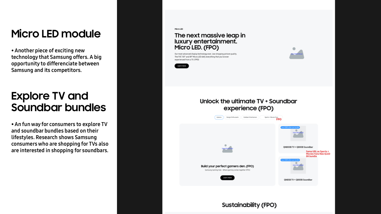
- This page also includes audio section for Q-Symphony (compatible with the 2022 Frame TV) and the brand new Ultra Slim Soundbar that goes perfectly with The Frame TV.
UX Wire - Highlights
![]()
UX Wire - Design & Accessories
![]()
UX Wire - Art Mode & Technology
![]()
Highlights
![]()


Design & Accessories
![]()


Art Mode & Technology
![]()

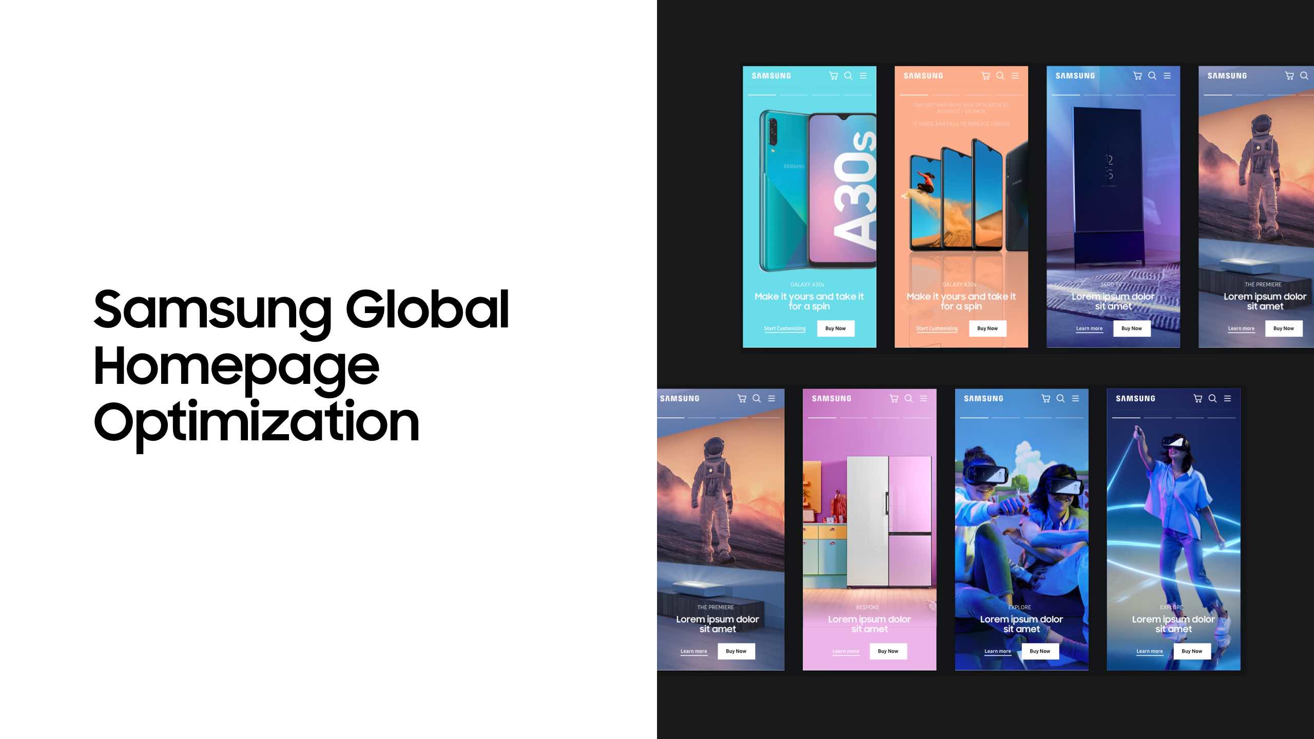
2019-2021 work for Samsung.com—
Compiled work for Samsung from 2019~2021 including design system update, landing page refresh, and global nav bar redesign.
Samsung.com US Site Refresh
Apr 2020 - 2023
In early 2020, Samsung Global started undergoing a site-wide design overhaul.
We were tasked with redesigning 46 pages across Samsung Mobile, Home Electronics,
Home Appliances, Computing, and Smart Home categories.
All pages went through several rounds of authoring and QA with the developers and were pushed live on .
The client was very pleased with what we were able to achieve despite the extremely tight timeline. (About 2 months).
I’m showing two examples below:
Product Category Detail Page - Smart Phones
Product Family Showcase Page - Home Appliances
Samsung Global Navigation Bar Redesign
Mar 2019 - Jun 2020
I was tasked with redesigning the content and maintaining the Samsung Global Navigation Bar in the Sketch symbol library.
The GNB was pushed live in early March and maintained through June 2020.
I was tasked with redesigning the content and maintaining the Samsung Global Navigation Bar in the Sketch symbol library.
The GNB was pushed live in early March and maintained through June 2020.
Galaxy Tab S6 Lite
Our client requested for both the highlights page and specs page to be designed in two weeks.
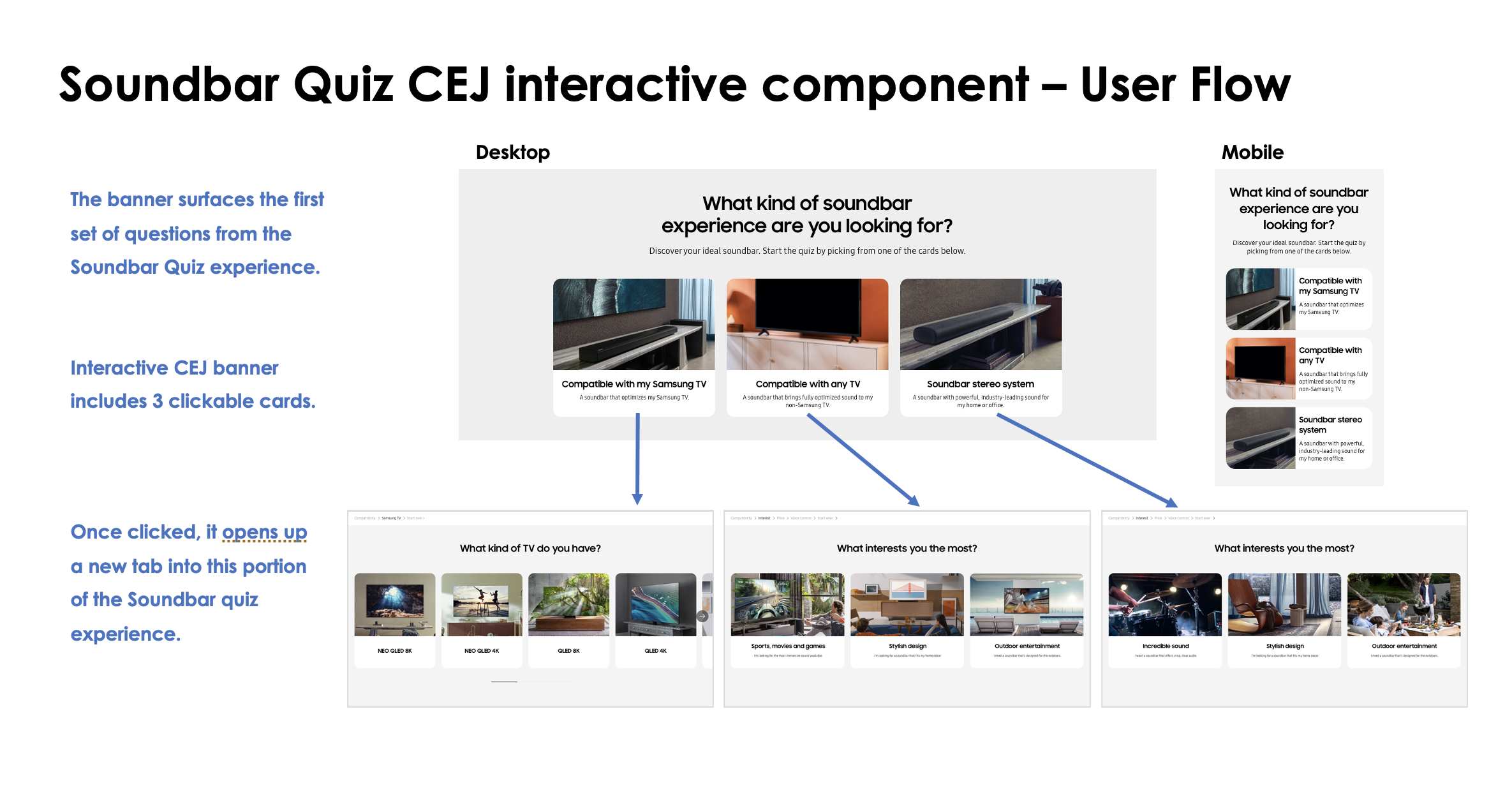
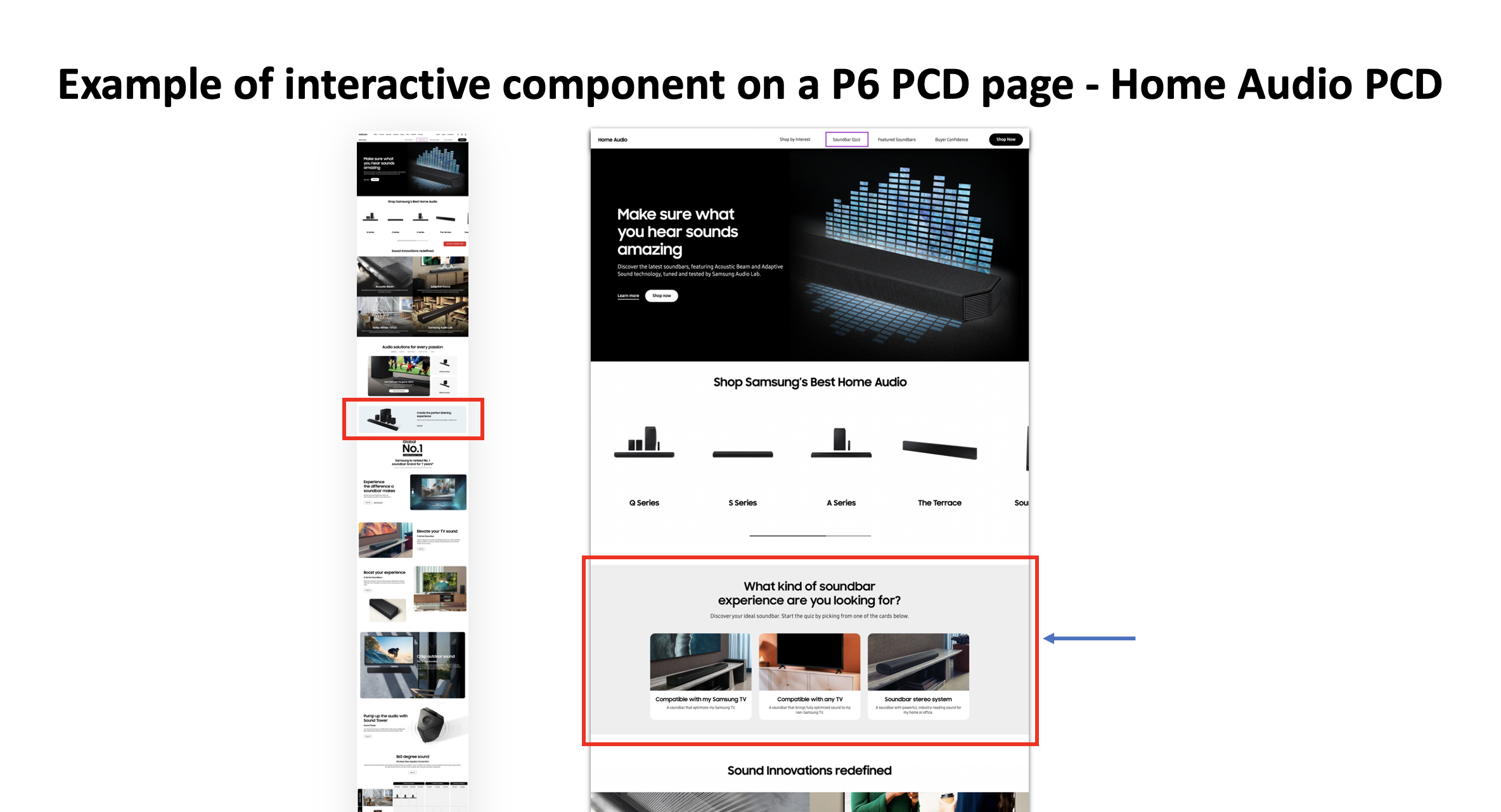
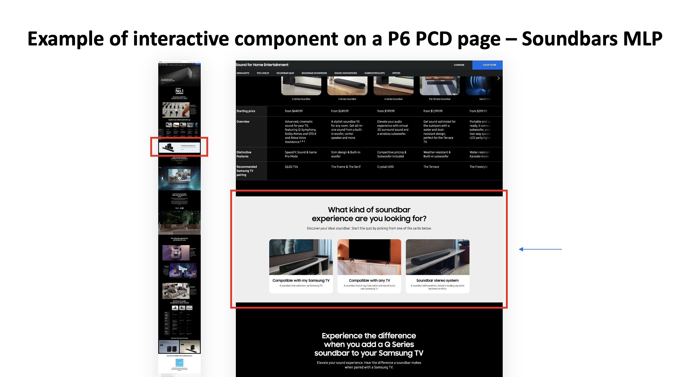
Soundbar Quiz 2022
—
Refresh of Samsung.com Soundbar Quiz experience to include 2022 new soundbar products - will launch in September 2022.
https://www.samsung.com/us/televisions-home-theater/home-theater/soundbars/soundbars-quiz/
https://www.samsung.com/us/televisions-home-theater/home-theater/soundbars/soundbars-quiz/
Jul 2022
The soundbar quiz experience was created in 2021 to help customers explore the best soundbar options that Samsung offers based on their interests and lifestyle. My team and I was tasked to refresh the experience to include 2022 sounbdar products.
The soundbar quiz experience was created in 2021 to help customers explore the best soundbar options that Samsung offers based on their interests and lifestyle. My team and I was tasked to refresh the experience to include 2022 sounbdar products.
We are also in the process of updating the Soundbar Quiz CEJ banners across .com to improve discoverability, click through rate, and coversion rate.

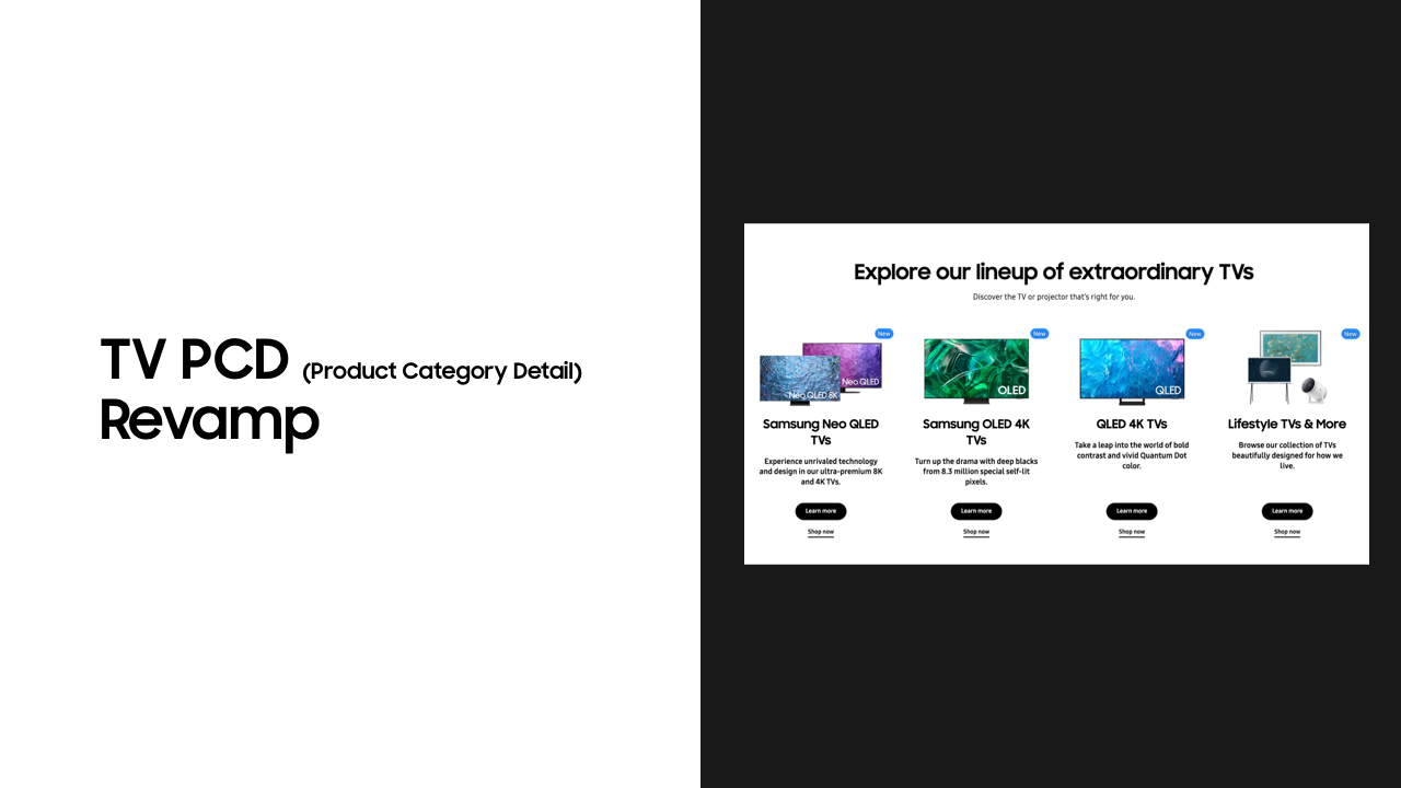
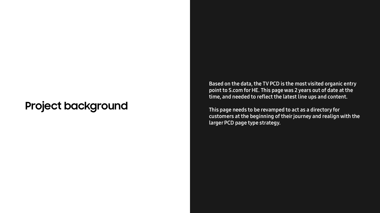
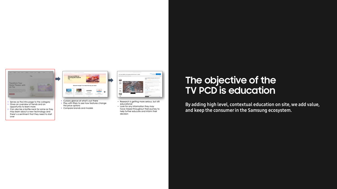
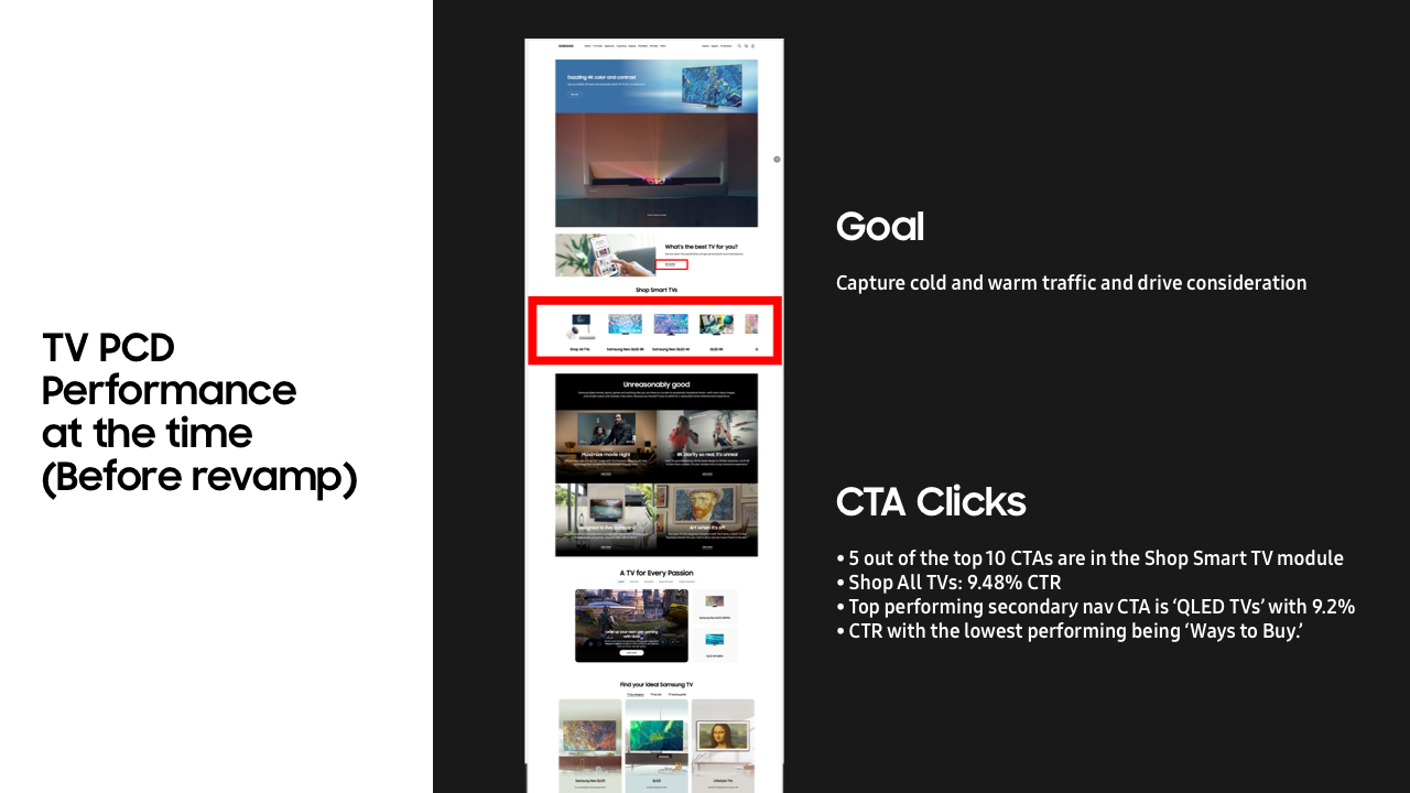
Samsung TV Product Category Detail page revamp
—
Refresh of the TV PCD page to showcase new Samsung TV technology and to act as an educational page to help consumers narrow down their choices.
https://www.samsung.com/us/tvs/
https://www.samsung.com/us/tvs/