
OUR MTA—
Reimagining the MYmta app

︎
If you live in New York City, you’ve probably noticed that this past summer the M.T.A. launched their own app called MyMTA.
You probably also noticed that the ads for this new app are popping up everywhere in various subway stations, on their new interactive underground screens and banners in the subway cars prompting you to download the app.
So I thought, why not give it a try? I haven’t really found an app good enough for the extremely unpredictable M.T.A. schedules afterall.

BEFORE WE BEGIN
When you launch the app there is a little animation that takes you to the home screen. The elements are very clean, easy to understand, and friendly so I decided to incorporate some of the colors into my redesign.
When you launch the app there is a little animation that takes you to the home screen. The elements are very clean, easy to understand, and friendly so I decided to incorporate some of the colors into my redesign.
OK, LET’S DIVE IN...
The first thing that I noticed on the home screen was the taskbar floating in the middle of the screen:
![]()

To me as a user, it is very confusing that the taskbar is floating in the middle of the screen. My eyes don’t know where to look.

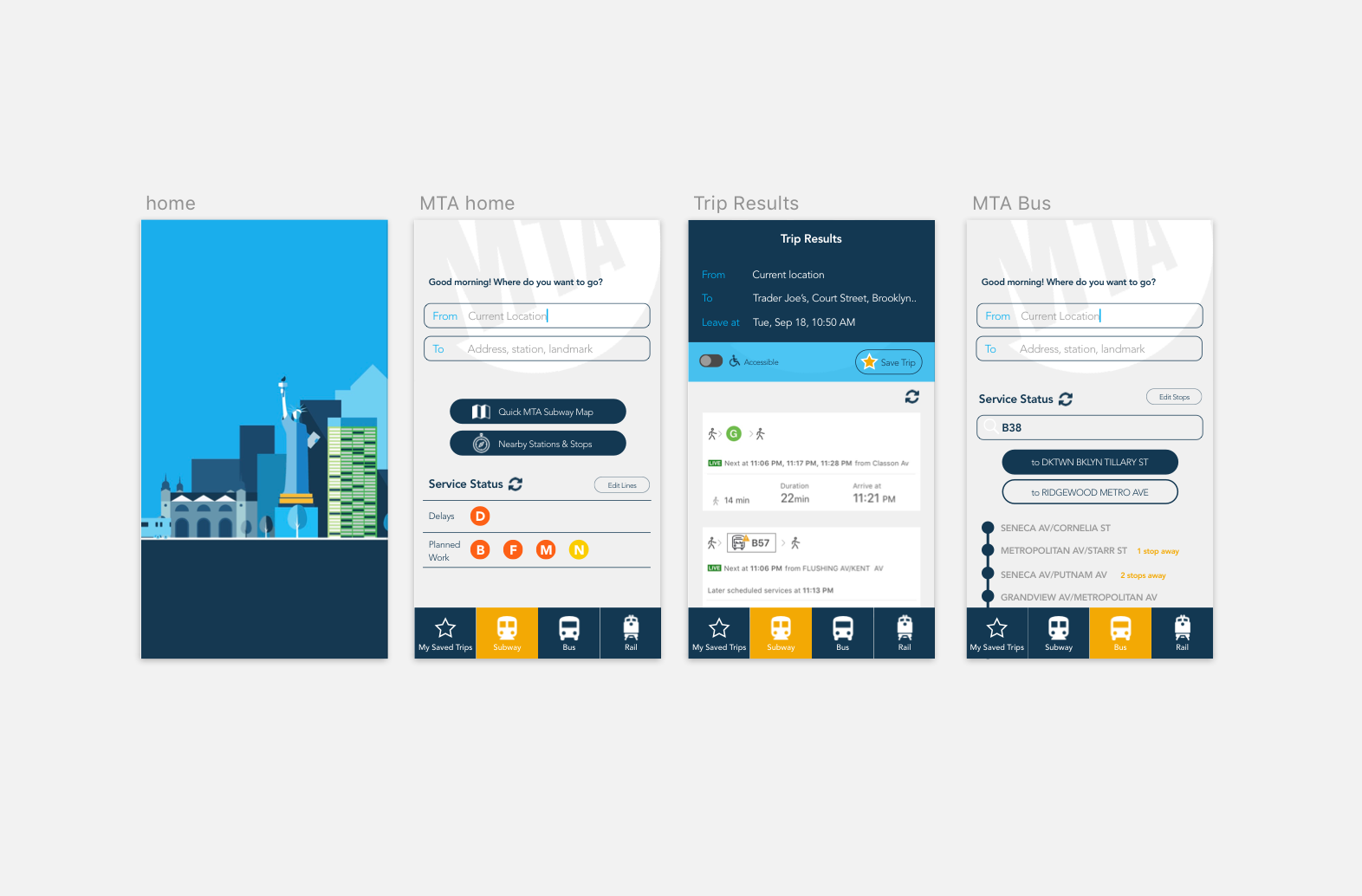
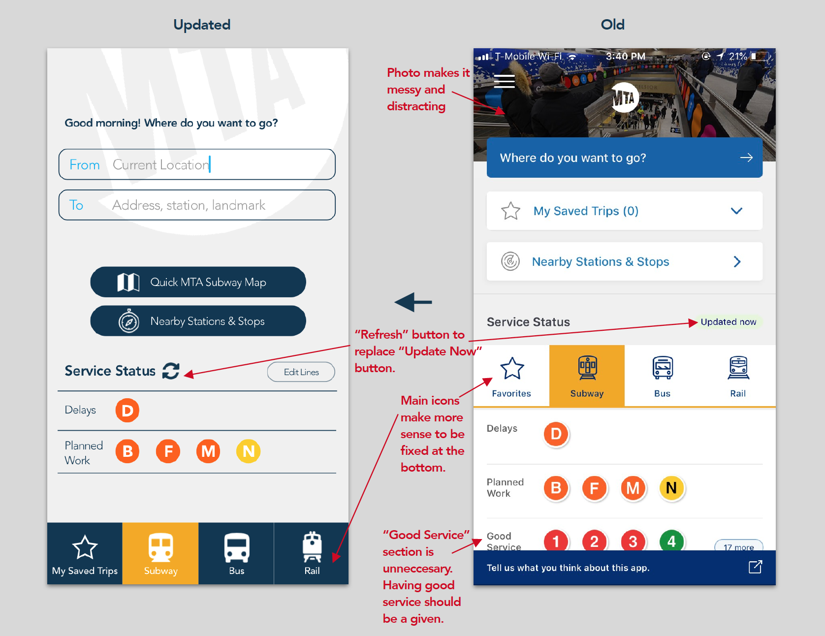
I started out by moving the taskbar, which provides the quickest access to the most important content of the app, to the bottom of the screen where it is most reachable at my fingertips.
The main issue I wanted to tackle while redesigning the screens was to reduce all the clutter. I removed the picture of the subway station at the top of the screen, unified the background color into one single grey, removed the shadows from the subway line icons, and only left the most important buttons at the top of the screen.
The main issue I wanted to tackle while redesigning the screens was to reduce all the clutter. I removed the picture of the subway station at the top of the screen, unified the background color into one single grey, removed the shadows from the subway line icons, and only left the most important buttons at the top of the screen.
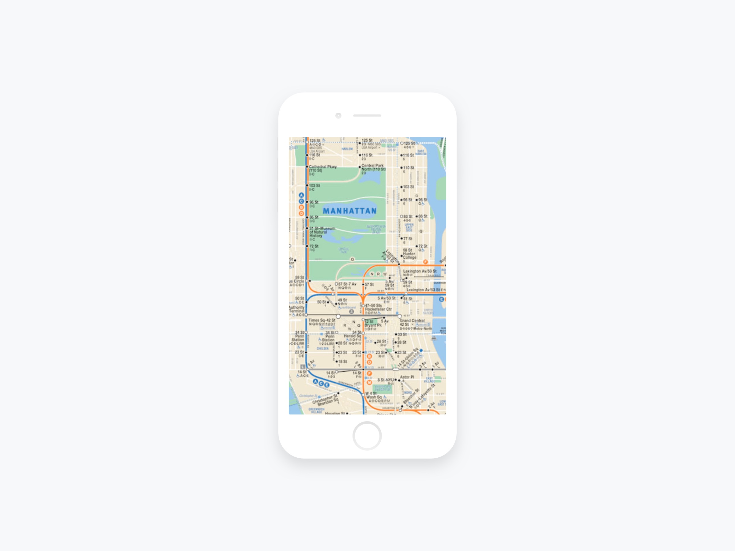
From my personal experience, whenever I’m trying to figure out subway routes while underground and in a hurry, (as you know, New Yorkers are ALWAYS rushing to get somewhere, right?) the first thing I always pull out is a saved picture of the subway map on my phone.
To me it is just way faster to pull out the map and gain a general sense of which lines to take and which stations to transfer at, instead of waiting for your phone to connect to wifi, open up your transit app, wait for it to load, type in all the information... it’s loading too slow!…okay it’s finally coming up slowly, oh no the train is arriving now!…oh no do I get on this train or not?! Forget it I’ll just hop on and then figure it out later…dammit I’m on the wrong train!
To me it is just way faster to pull out the map and gain a general sense of which lines to take and which stations to transfer at, instead of waiting for your phone to connect to wifi, open up your transit app, wait for it to load, type in all the information... it’s loading too slow!…okay it’s finally coming up slowly, oh no the train is arriving now!…oh no do I get on this train or not?! Forget it I’ll just hop on and then figure it out later…dammit I’m on the wrong train!
(There should be a back arrow on the upper left hand corner that will be added.)
I then reduced the “Update Now” button into the refresh icon to declutter the screen, and added the “Edit Lines” button so that you have control over which subway lines you want to see. There are 27 NYC subway lines out there, more than any other subway system in the world! I doubt anyone will care about all the delays and planned works on every single line, right?
The white MTA logo against the light grey background was an idea to replace the current small logo in the middle of the screen.
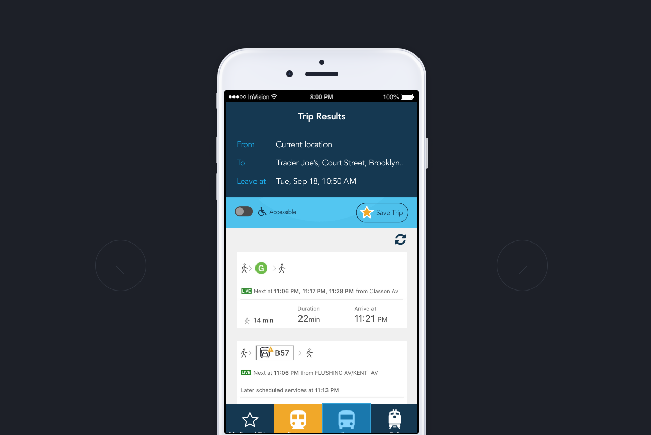
For the Trip Results page, I basically just cleaned it up a bit using the colors from the startup screen.
The white MTA logo against the light grey background was an idea to replace the current small logo in the middle of the screen.
For the Trip Results page, I basically just cleaned it up a bit using the colors from the startup screen.

I removed the bar with “Fewest Transfers, Fastest, Least Walking” buttons because I thought that might be redundant if all the options that come up already show you how many transfers you will have and how long you will be walking.

Moving on to the Bus tab, for me personally I really don’t care about if there’s any planned services changes for buses. When I’m waiting at the bus stop, I really just want to know two things: I want to know where my bus is and when it’s coming.
The M.T.A. has a site called MTA Bus Time, where it lets you check exactly where your bus is.
I actually find it very helpful and use it regularly myself when I ride buses, so I thought why not just add that to the app instead?
The M.T.A. has a site called MTA Bus Time, where it lets you check exactly where your bus is.
I actually find it very helpful and use it regularly myself when I ride buses, so I thought why not just add that to the app instead?
After going through all this the stubbornness inside me might still just pull out the good ol’ NYC subway map and try to figure it out on my own. But I’m sure it’ll come in handy for the Bus and Rail schedules. Also, visitors who come from out of town might find it helpful to rely on it as well.
It’ll be interesting to see how this app evolves in the future.
It’ll be interesting to see how this app evolves in the future.
What do you think of the MYmta app? I would love to hear your thoughts! Feel free to comment on Medium.